Simple Layout with CSS Grid

When designing the home page for Paul Brighton’s Web Development blog (My old blog) I wanted to add a section with a collection of articles with images and a title that when clicked on would link to the actual article.
The design called for a single column for mobile, two columns for tablets and three columns for desktop.
There are many options to layout pages and in the past I have mainly used floats to achieve the desired effect. For the following tutorial, I want to show you how I used CSS Grid to make my responsive three column grid to hold my articles.
Simple CSS Grid Tutorial
As this website was designed from a mobile first perspective, we will start with a max width of 1120px for the main container and give it a margin of 0 auto to centre it on the page.
.o-article-preview {
  max-width: 1120px;
  margin: 0 auto;
}
We then want to set the mobile layout to a single column, this is where we start to use CSS Grid. First, we set the width to 90% and the display to grid, I then set the grid-template-columns to 1fr (fractional unit). The grid column gap will add some space between the article previews when we get to adding another column.
&__container  {
    max-width: 90%;
    display: grid;
    grid-template-columns: 1fr;
    grid-column-gap: 3rem;
    margin: 0 auto;
  }
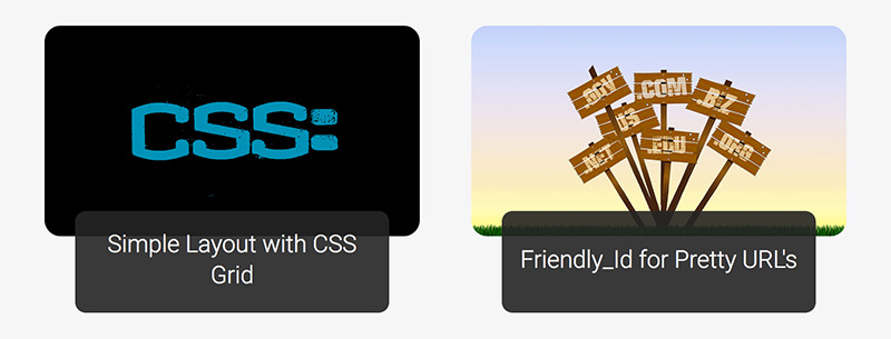
As you can see, the articles are now displaying in a single column that looks good on a mobile phone.

Now we want to set the layout to two columns for tablet sized screens. To do this, we can use a media query that states that we want two columns when the screen size is over 768px. In the code below, the column is now getting repeated twice, both with the same ratio using 1fr again.
@media screen and (min-width: 768px) {
  .o-article-preview {
    &__container  {
      grid-template-columns: repeat(2, 1fr);
    }
  }
}
The layout for the tablet sized screen now displays two columns.

All we need to do now for desktop screens is repeat the process that we used for the tablet screen but use repeat(3, 1fr) for screen sizes of 1024px and above.
@media screen and (min-width: 1024px) {
.o-article-preview {
  &__container {
    grid-template-columns: repeat(3, 1fr);
    padding-bottom: 15px;
    }
  }
}
And there we have it, a three-column layout for desktops.

This is just a simple guide to start you off using CSS Grid in your front-end development but if you’re interested in learning more, there is an in-depth course available for free by Wes Bos and a nice CSS Grid generator at Layoutit!.
You can now start experimenting with CSS Grid in your next project. I hope you found this article interesting and thank you for reading.
